
HūS Beauty Studio

It’s great when you do what you love, but it is even better when you work with friends.
For Hūs Beauty Studio I had the honor and opportunity to be involved from the color palette selection to the door tags, passing by the logo creation, the tone, the website, the whole feeling behind the brand, bringing out a lot of the energy the owners have while keeping the brand elegant and mature.
For this endeavor, we did pick more earth/ boho tones due to the intentionality behind the brand, with a very peculiar icon that represents the feeling behind the idea of HŪS - which brings the sense of community, family, HOME.
I’ll leave the brand kit with the whole proposal for the logo down bellow.
Hope you enjoy.
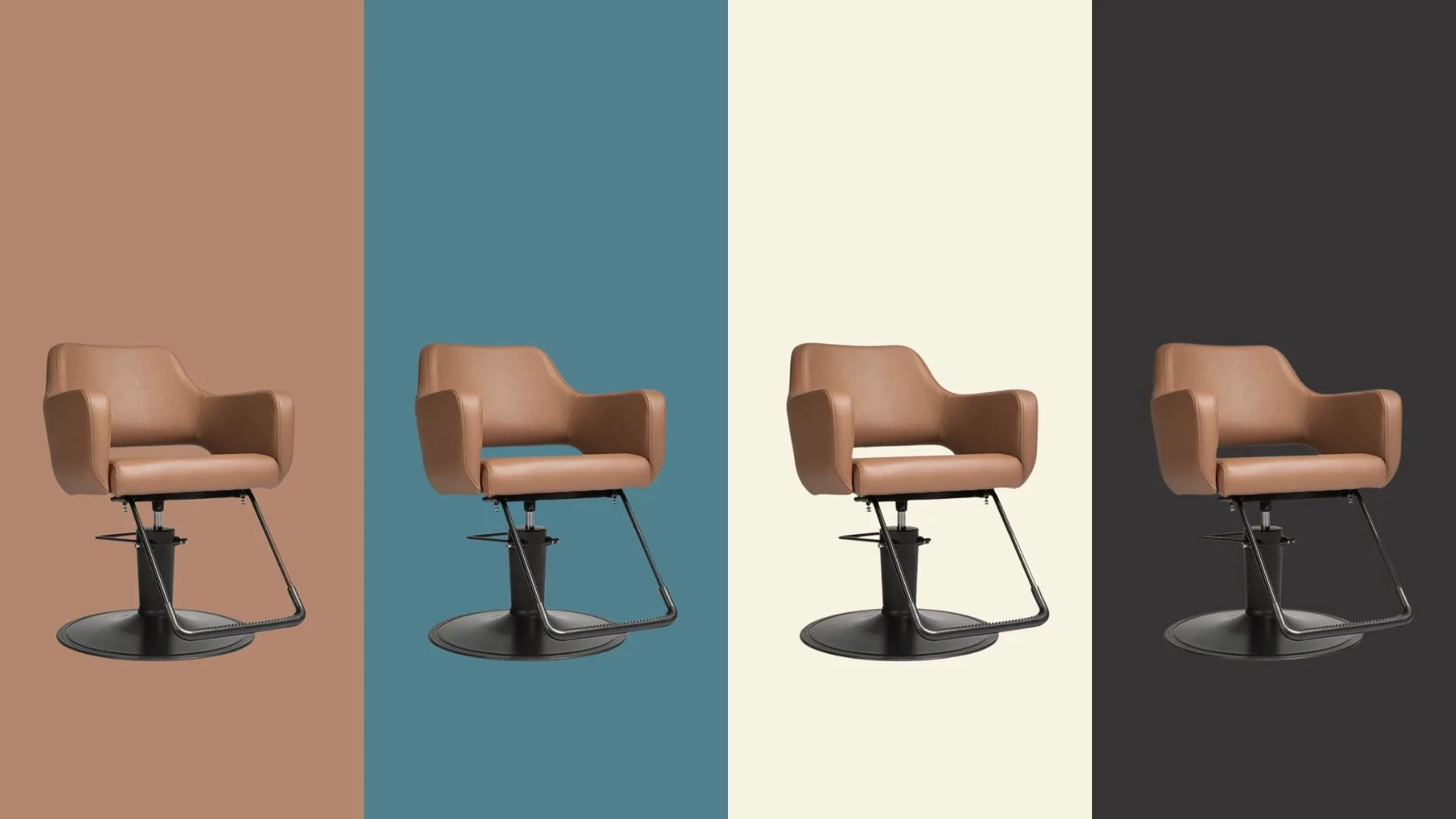
This was the initial color pallet that we developed together, having in mind all the equipment and all the furniture for the place so we have something that is not only digitaly cohesive but it is also choesive in the phisical sphere.
We soon removed the blueish tone from our palette, working only with the other 3 colors.
As soon as we made a decision on the colors and the intentions behind the brand, it was easy to develop the logo and the rest of the branding items.
Check out the brand guide.
Check out the full website for more.